Hamburgers Belong on the Grill, Not on Your iPhone
About Objects Design Team
|
5 min read
How many projects have you worked on where the client wants to throw in every feature and action they can think of? It often seems they want their app to have everything, plus the kitchen sink. And once they’ve specified some huge set of features, how do they want them organized? All too often, it’s via the infamous hamburger menu.
This is, unfortunately, a common pitfall for iPhone apps. First, an iPhone app isn’t a responsive website. Responsive web designers love to use hamburger menus. However, web designers have different constraints on how they must organize their content, and the nature of the content is generally different than that of a mobile app.
An iPhone app is a tool. Every action and task should be so easy that users don’t have to think about how to perform them. That way users can just focus on the tasks they’re currently trying to carry out.
Second, iPhones are not Android phones. Some folks prefer Android, others love iOS. While both are successful platforms, Apple does a great job of making the iOS platform very efficient and effortless to use. Android may have a lot of bells and whistles, and give you the freedom to do things that iOS doesn’t, but more isn’t always better. Usability goes a long way, and often trumps other considerations. Too much is a manifestation of complexity. Apple does a tremendous job of reducing the too much to help keep the focus on the essence.
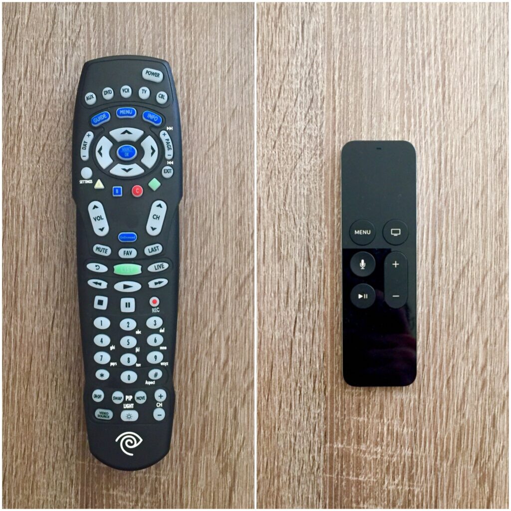
For example, your standard cable TV remote has a zillion capabilities, yet, how many buttons do you actually find yourself using? Now, look at an AppleTV remote. It delivers all its available features via six visible buttons and a trackpad. Compare that to a typical cable TV remote, sporting nearly ten times as many controls. Long story short, throwing in lots of functionality and grouping all of it in one place is not a good solution.
Do You Smell Hamburgers?
Normally, hamburgers smell delicious, but not when it comes to iPhone apps. Hamburger menus are notorious for being overloaded and unintuitive. Too often, a hamburger menu serves as a catch-all for uncategorized requirements that aren’t tied to an app’s core purpose. In fact, the use of hamburger menus can become a crutch — a way to avoid carefully thinking through an app’s information architecture, and skip the hard work of designing a solution. It’s the creative equivalent of a shoulder shrug.
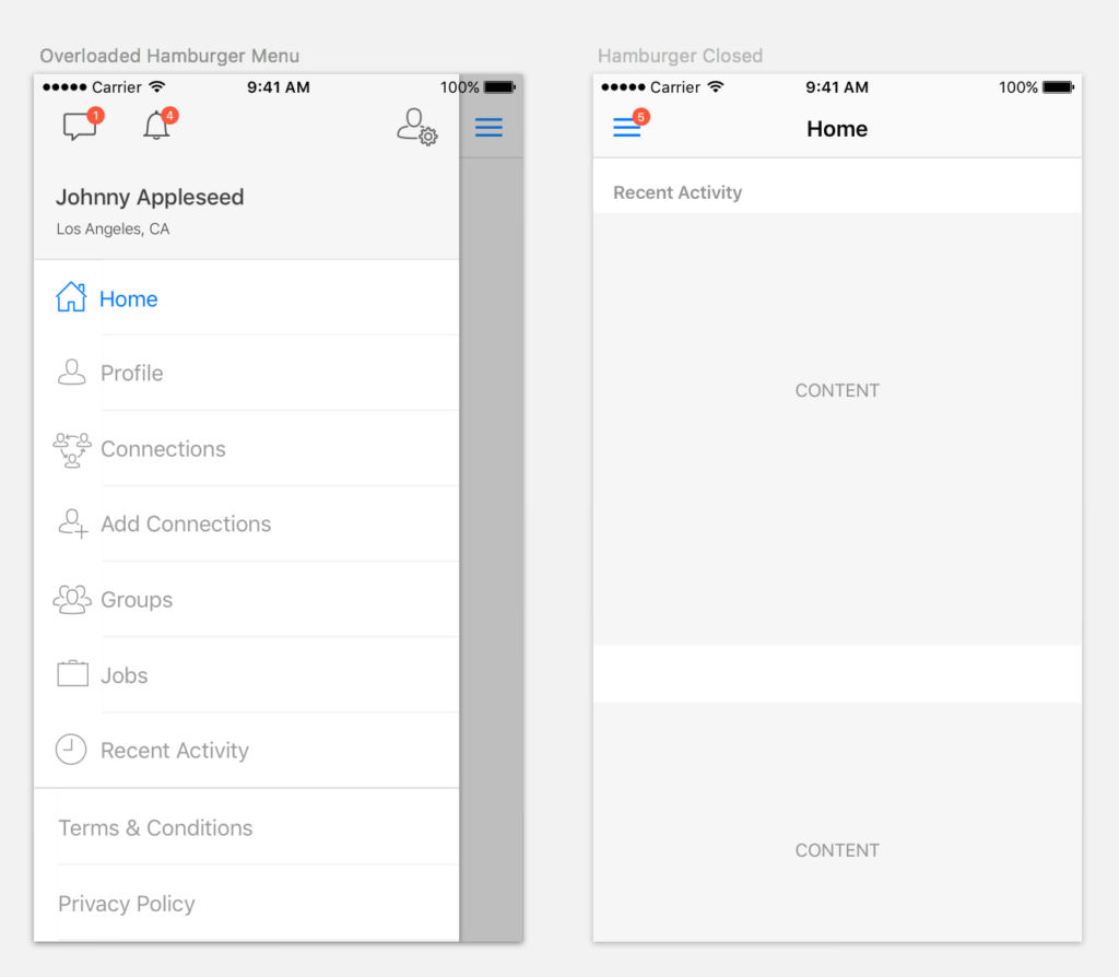
By encouraging an unlimited number of options to be thrown in, hamburger menus tend to result in user interfaces that require more thought and attention from the user. In this scenario, users have to read and scroll through all of the options in the menu to find a given action, and then choose one that best describes the task they want to perform. In addition, when the menu is closed, all of the app’s features are hidden, leaving users without any visual indication of the app’s range of capabilities.
Okay, okay. We’ve all read the blogs that say how much hamburger menus suck, but not many of them talk about alternatives.
The Alternative
First, to keep a mobile app as simple as it needs to be, the organization of features and tasks must be thoroughly analyzed, prioritized and mapped out. Limiting an app’s features strictly to those required to provide a coherent and meaningful user experience is essential to achieving that Apple-like simplicity. Fewer options yields faster and easier decisions for users.
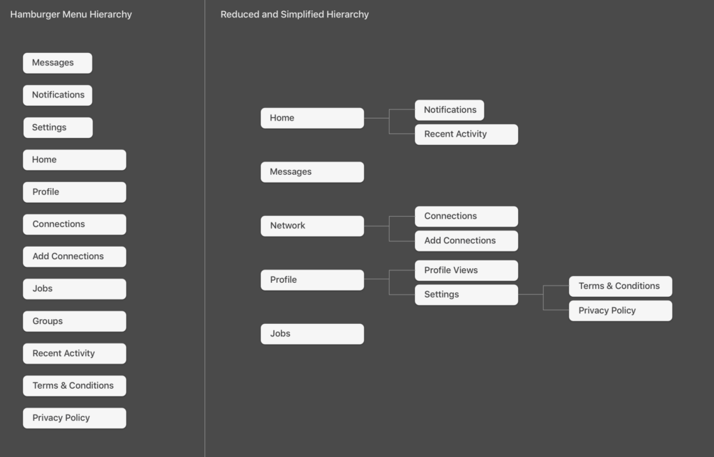
To begin, classify and categorize app features and tasks into meaningful groups to provide a context in which they’re more understandable. Just remember to keep the number of these groups small. You don’t want your app to suffer from TV Remote Syndrome!
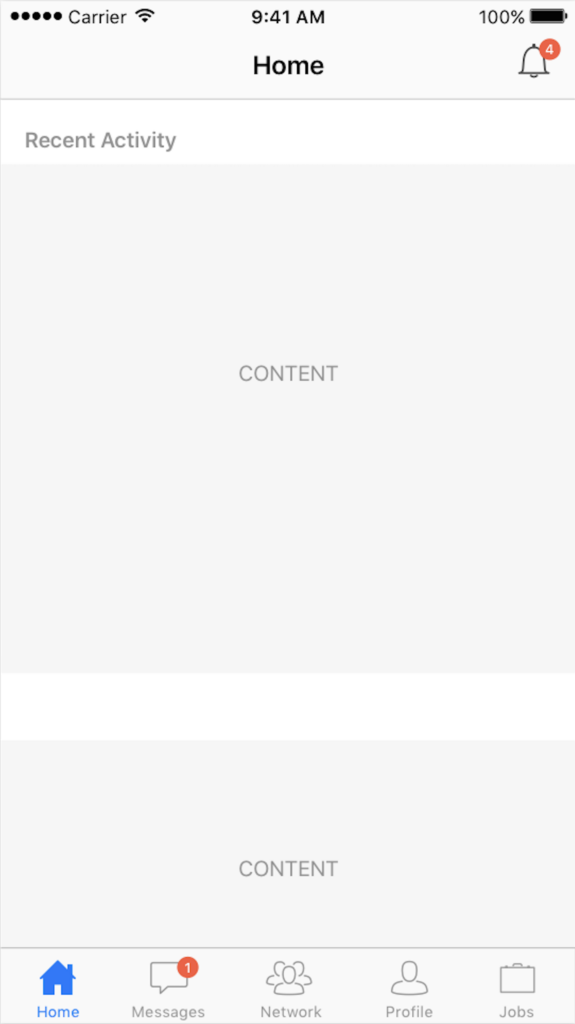
A tab bar is often a better solution than a hamburger menu for a couple of reasons: one, using a tab bar forces you to keep your main navigation to a minimum, as the iPhone displays a maximum of five tabs. Two, it ensures that the essence of the app can be seen immediately, providing calls-to-action for users that can be accessed globally for efficient navigation.
Because a tab bar’s items aren’t hidden away in a drawer, they allow the most useful tasks and features to be located in an optimal manner, without sacrificing a great deal of UI real estate. More generally, standard iOS framework components embody UI paradigms that provide a consistent and familiar user experience. Using standard iOS components such as tab bars nearly always saves significant development time and cost over other, more custom solutions. In our experience, unnecessary customization can more than double development costs while yielding a sub-par user experience.
In general, it’s best to exhaust the possibilities afforded by designing around components from Apple’s iOS frameworks before resorting to custom solutions that reference other platforms. A good resource for help understanding the iOS platform frameworks is the iOS Human Interfaces Guidelines (HIG). Among other things, the HIG provides great insights into where, when and how to use standard UI components.
So next time, before adding the kitchen sink, take a step back and define what users will actually use while on the go with their devices. In our busy lives, most of us just don’t have the time to sit and read a user manual or dig through all of the features of apps that suffer from TV Remote Syndrome. Try streamlining your app’s design by using native iOS navigational components — and leave the hamburger for the grill.